So most of the teams, apart from like two of them, have given us their home kits for next season. However, all 20 have provided at least one kit and I’ve been through them all and assessed them for your pleasure. Now, be warned, I’m not listing all 20 teams, I’ve picked the best and the worst ones. These are, of course, only my opinions – yours will differ so don’t come at me unless you agree.
The Best
Napoli (Both)
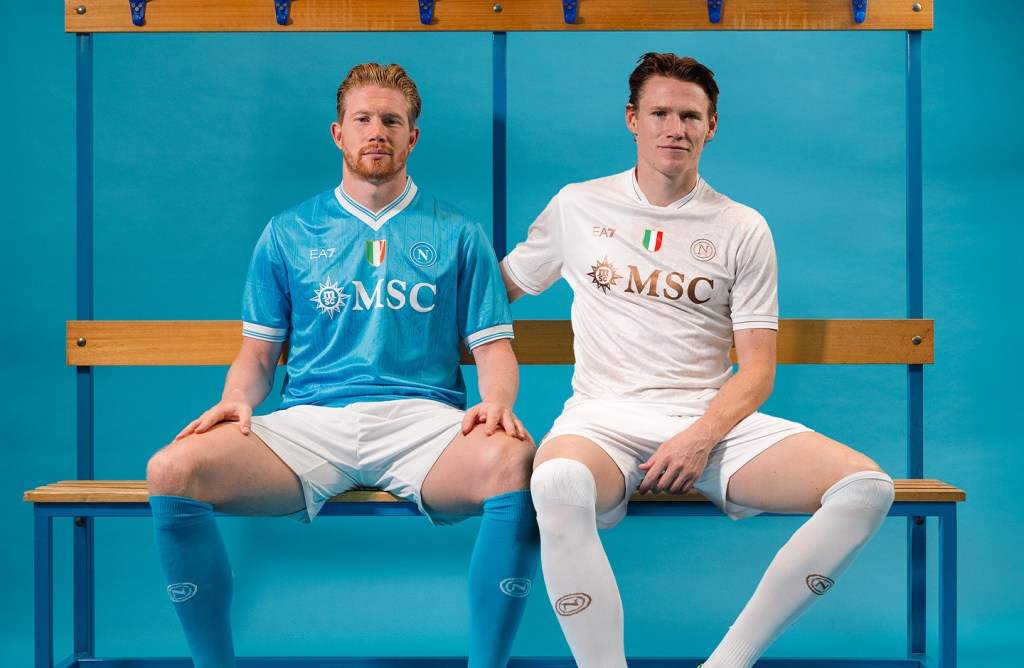
My word. Not only are they champions, not only do they have De Bruyne and McTominay together but these kits are works of art. The home is nice and clean, classic, it’s hard to get it wrong when you go simple. But it can be equally hard to get something beautiful – AND YET LOOK AT THAT AWAY KIT. Chef’s kiss. Well done Napoli, early trophy to you lot as best dressed this season.
Roma (Third)
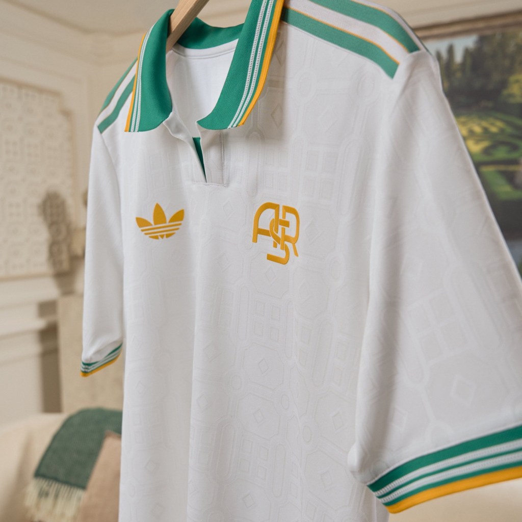
This third kit launched just after I wrote this initial blog and it couldn’t be more welcome! It pained me having to put the Roma home kit in the bad section. Then someone at the club read it and did something about it. Probably. It is pure sex. Should come with a health warning it’s that naughty. Give me more!
Como (Home)
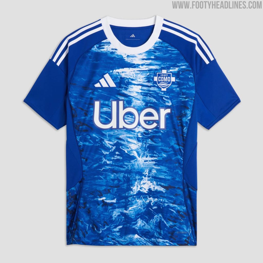
Yeah, everything about this works. The main chest of the shirt looks like the lake with some moonlight or something on it. And yet, despite that motif, it’s still pretty clean and basic. The colour consistency, the uncomplicatedness of everything else that isn’t the background. It’s gorgeous, 10/10 for Como.
Sassuolo (Home)

Promoted for their footballing merit, they could’ve gone up for this shirt alone. Everything about it I’m in love with. The design of it is simple, yet nods back to the 90s – everyone’s favourite nostalgic period currently. Love that collar on the shirt too, a good collar seems like a lost art. Little touches like anything else on the shirt only being in white is really smart too. I don’t normally buy “other clubs” shirts but I might this one… 15/10
Parma (Third)

Is it an early 90s Leeds kit? Is it the current Parma Third Shirt? Who knows but I want more of it. Parma should’ve used this as their home shirt for me. It’s clean, simple, slight throwback. It works. Well done.
Milan (Home)
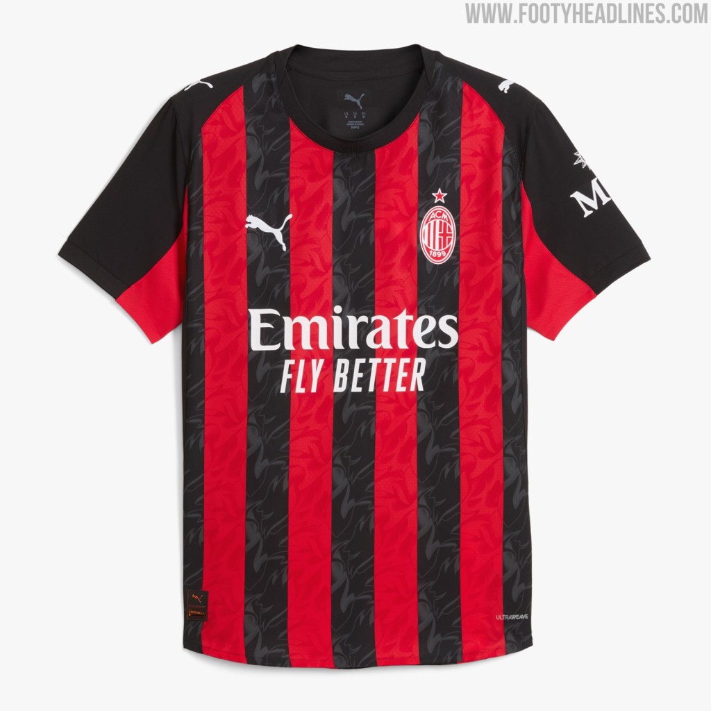
Ok, so I am typing this with gritted teeth as an Interista, but this kit is nice. They’ve done no messing about here, like Inter did with their stripes. This is a really nice effort, the two tone badge is cool and the little pattern on the stripes is a nice touch. Hope this is all they get right this season. Well done Milan.
The Worst
Inter (Home)
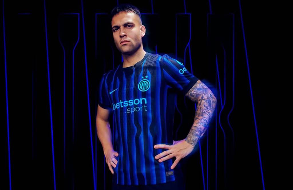
Rumour has it they took over 3 millions photos of Lautaro in this shirt and he refused to smile in this kit. I think when teams try something a bit different it can work, it refreshes their style and it can be a nice departure. None of that is true here. Inter have some of the best kits of all time and they’re all just SIMPLE BASIC BLUE AND BLACK STRIPES! What they’ve been up to the last couple of seasons I can’t tell you, but it isn’t cool. Go back to what you do best.
Juventus (Home)
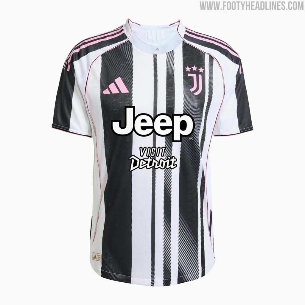
Stop messing about with stripes. All teams. Now. If you have stripes, look at Milan and Atalanta and do that in your colours. Hate the haphazard stripes here, hate the two sponsors and although I know Juventus used to wear pink when they were founded, I hate the pink accents. Please god, just get together with Inter and bang your heads together.
Cremonese (Home)
Goalkeepers wear grey kits. There’s not a lot else to say. It’s a weird colour for an outfield shirt and I’m not on board. Pass.
Lazio (Home)

Guess what guys? Lazio have a plain sky blue shirt. They’ve made zero effort here and I’m not making any effort to talk about it. Wear the away kit, it’s a much sharper look.
Inter (Away)

Two things here. 1) Was this designed by a competition winner? 2) How did they win the competition with this design? Honestly, after the embarrassment we Interisti suffered at the end of last season, these kits feel like Nike rubbing it in a bit. Pass.
Juventus (Away)
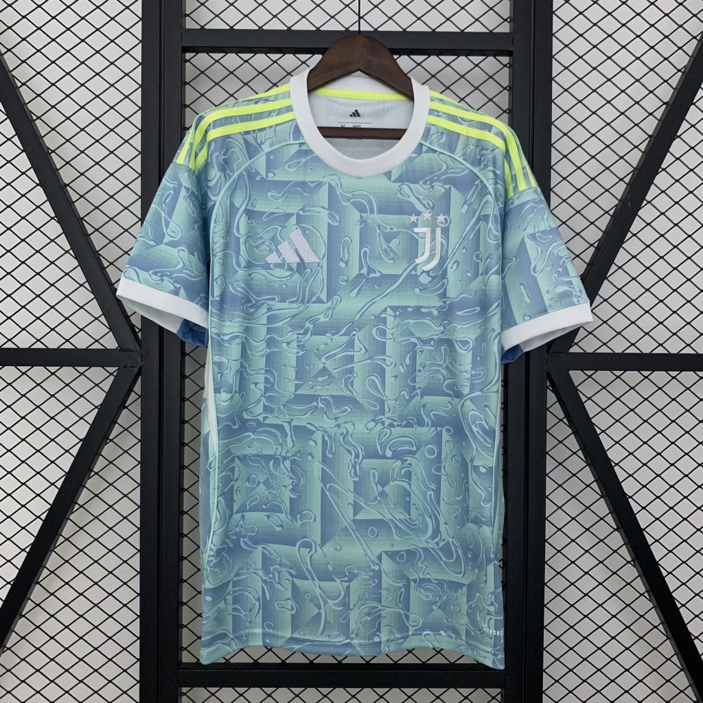
This looks like the hooky shirt you see hanging from a souvenir stand in a main piazza in Turin. Why this colour? Why the yellow Adidas stripes? Why are there two sponsors on the home shirt and none here? None of this adds up, I’m sure there’s a conspiracy here but I don’t know why, or what. Just wear that gorgeous third strip all season please.
Roma (Home)

Ok so hear me out here, because maybe there’s nothing actually wrong with this, maybe there is. I just feel like Roma normally turn out in such beautiful kits that this feels a little… generic? Again, it looks like a copy of a real Roma kit. Maybe the PES version of a Roma shirt. It’s not awful, it’s not horrible, it’s just not very Roma for me.
So there you have it, I’m sure some of you are upset by my choices, it goes without saying! But as you can see I’m not biased, an Interista choosing Milan’s shirt as nice and condemning the Inter efforts! Anyway, I’m off to Sassuolo to buy a shirt. Let me know your favourites…
